
Štark has been a household name in Serbia since 1922.
Štarks chocolates & biscuits have for long been present in moments of celebration; traditionally given as gifts in family occasions. Despite the quality of the products, over the years, the brand was loosing its appeal with the younger audiences partially due to its old fashioned packaging and visual identity.
To celebrate its 100th anniversary, Štark felt the need for a rebrand.
I was brought in to work with Marks Amsterdam to help with the pitch to win over the project.
Since the initial push, the design I'm sharing was refined and evolved, but here is the initial thinking.
Since the initial push, the design I'm sharing was refined and evolved, but here is the initial thinking.
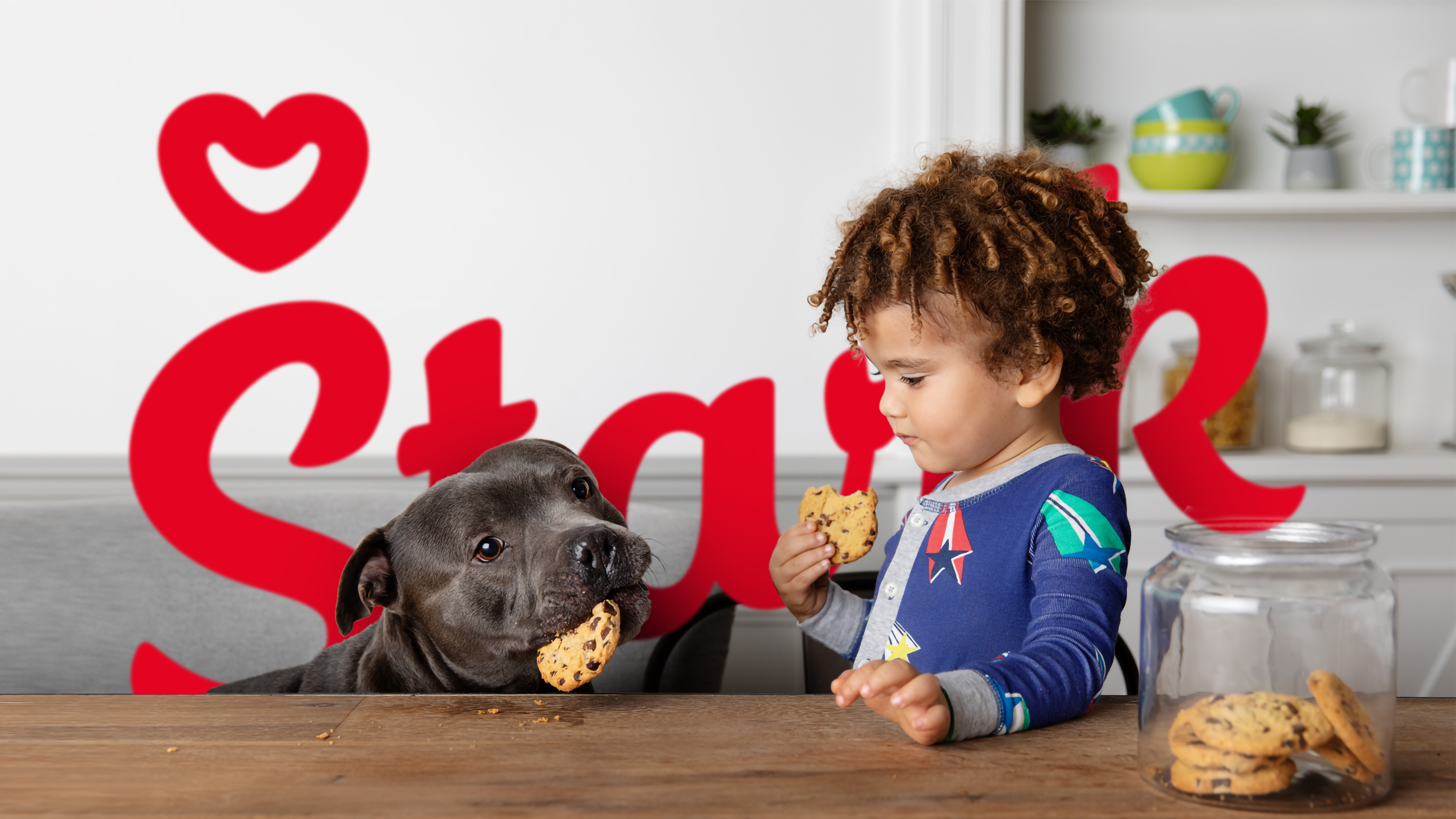
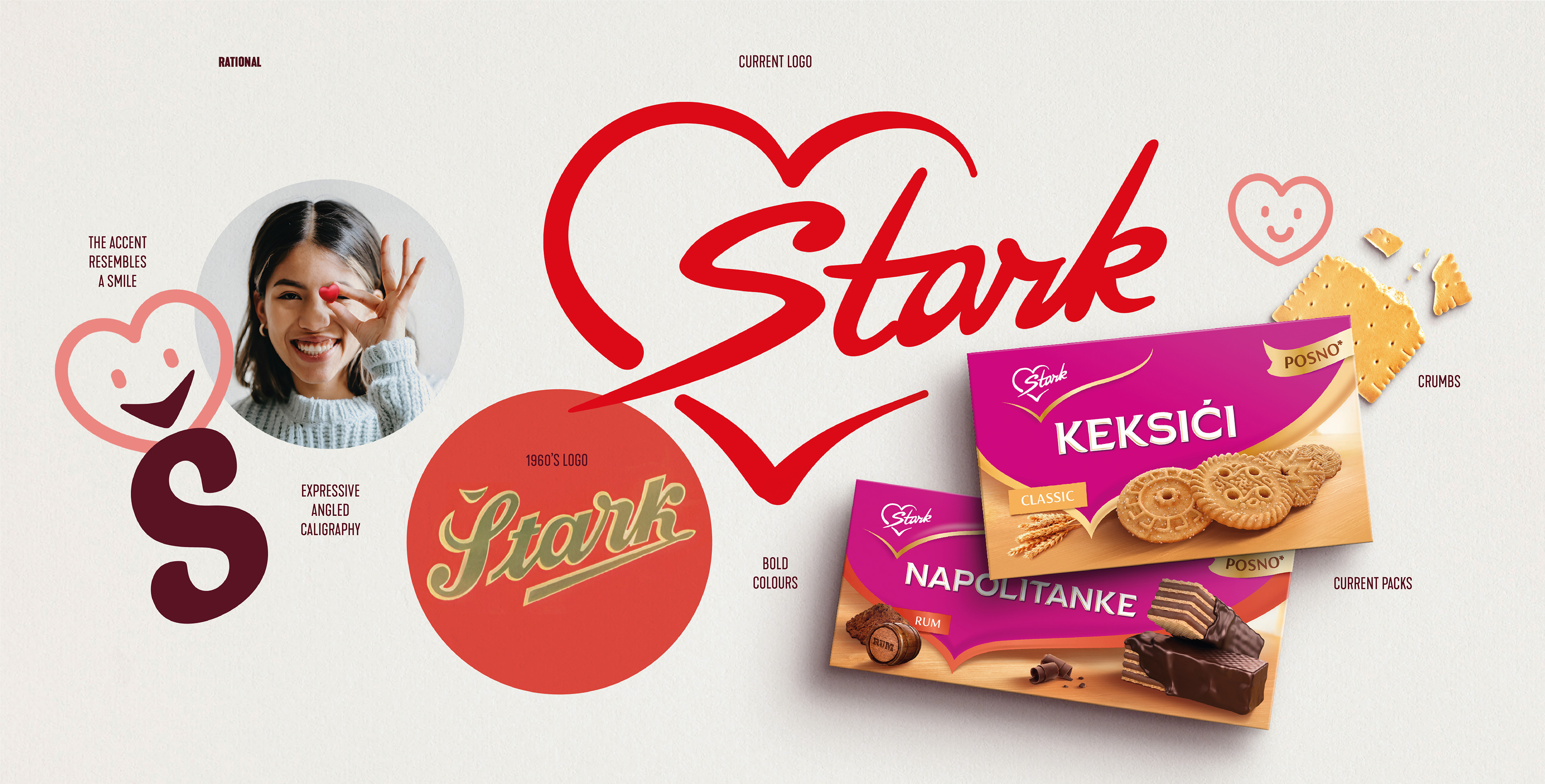
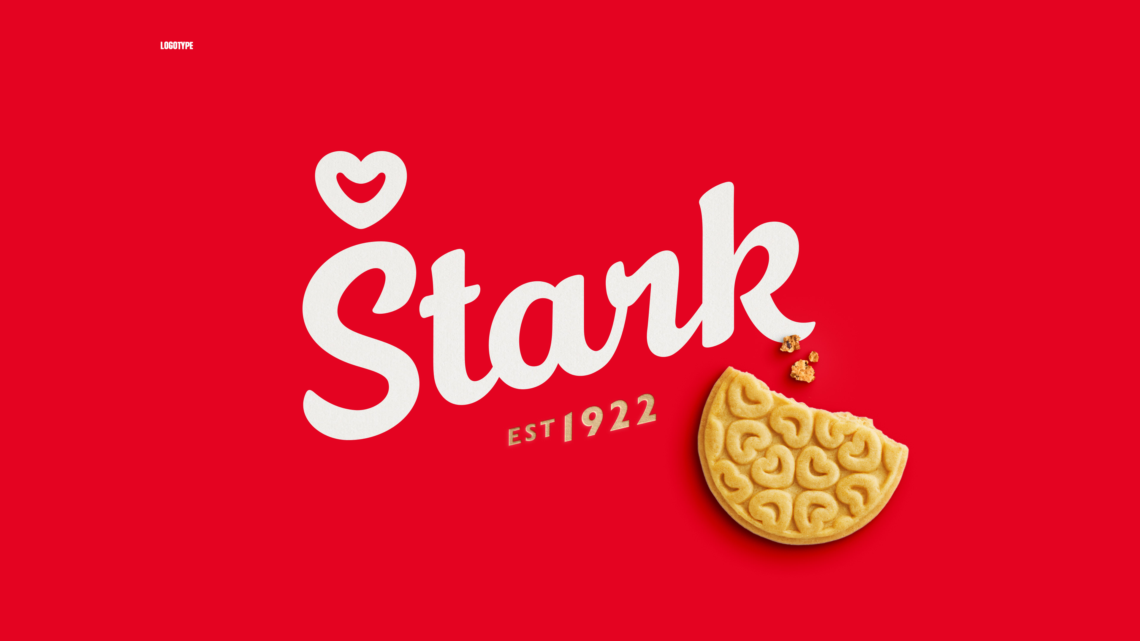
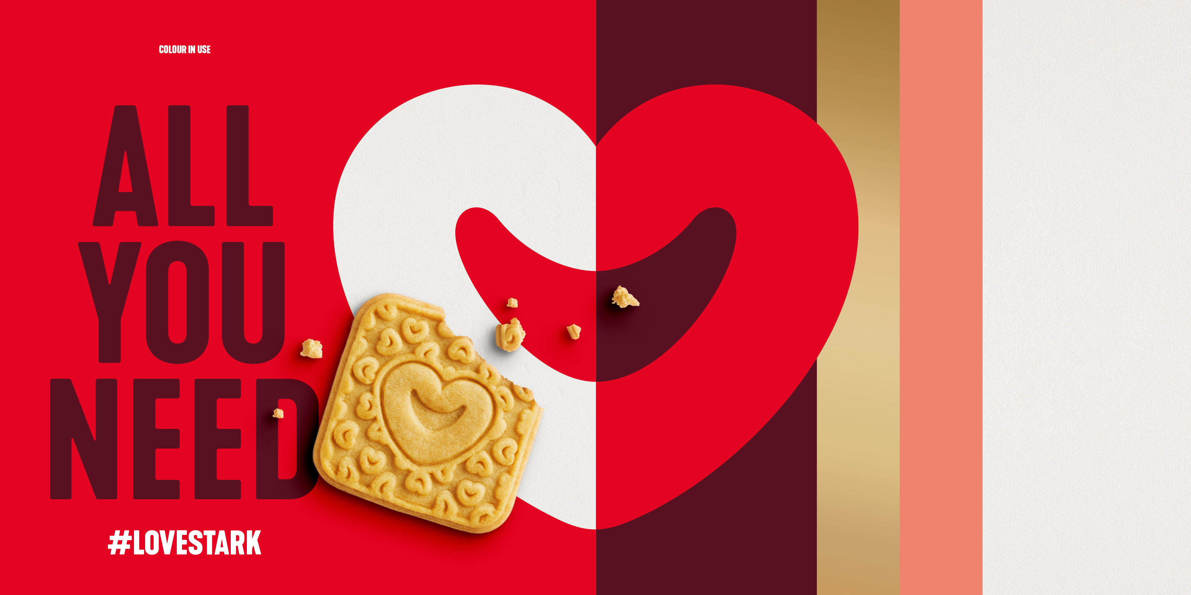
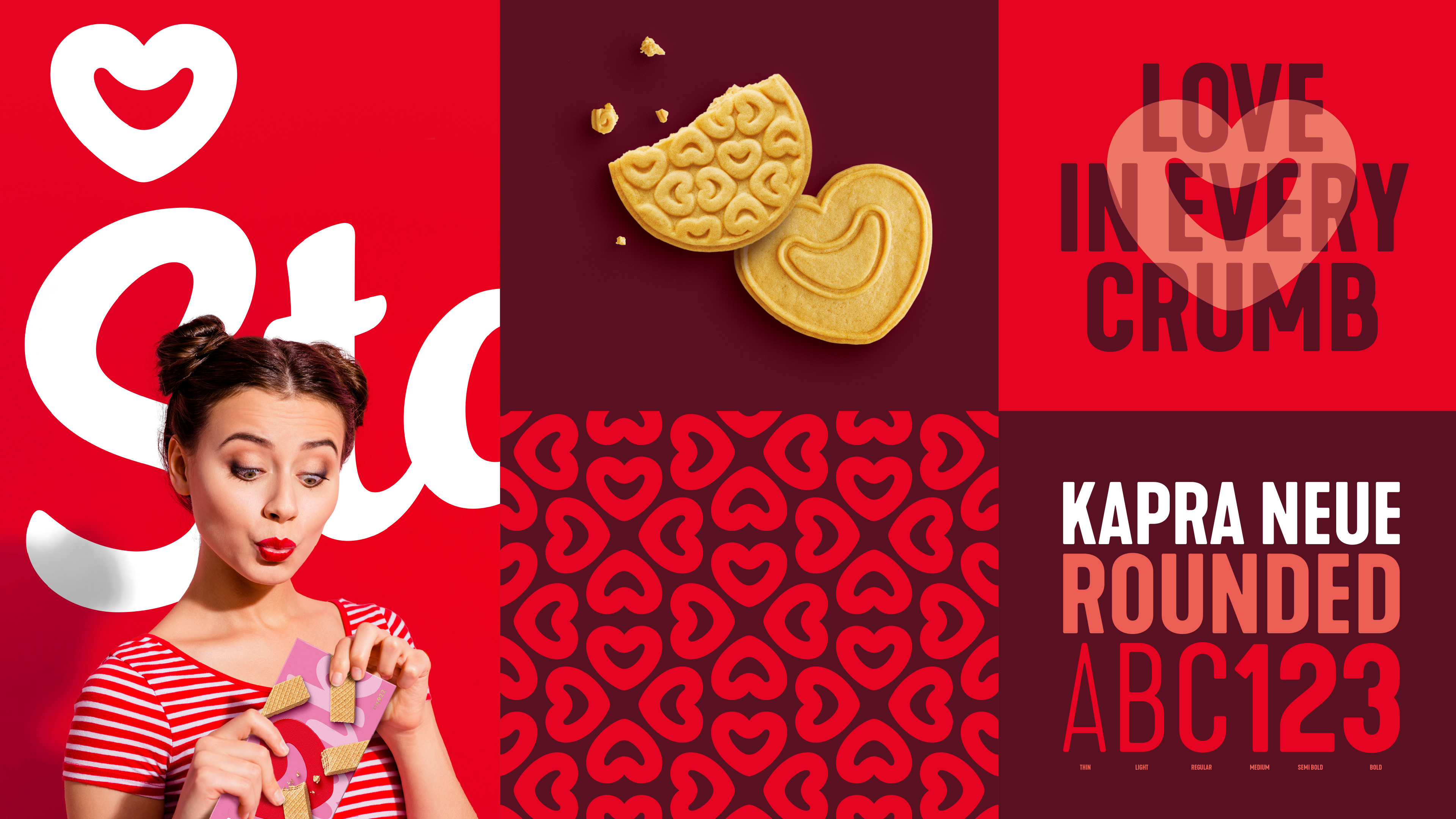
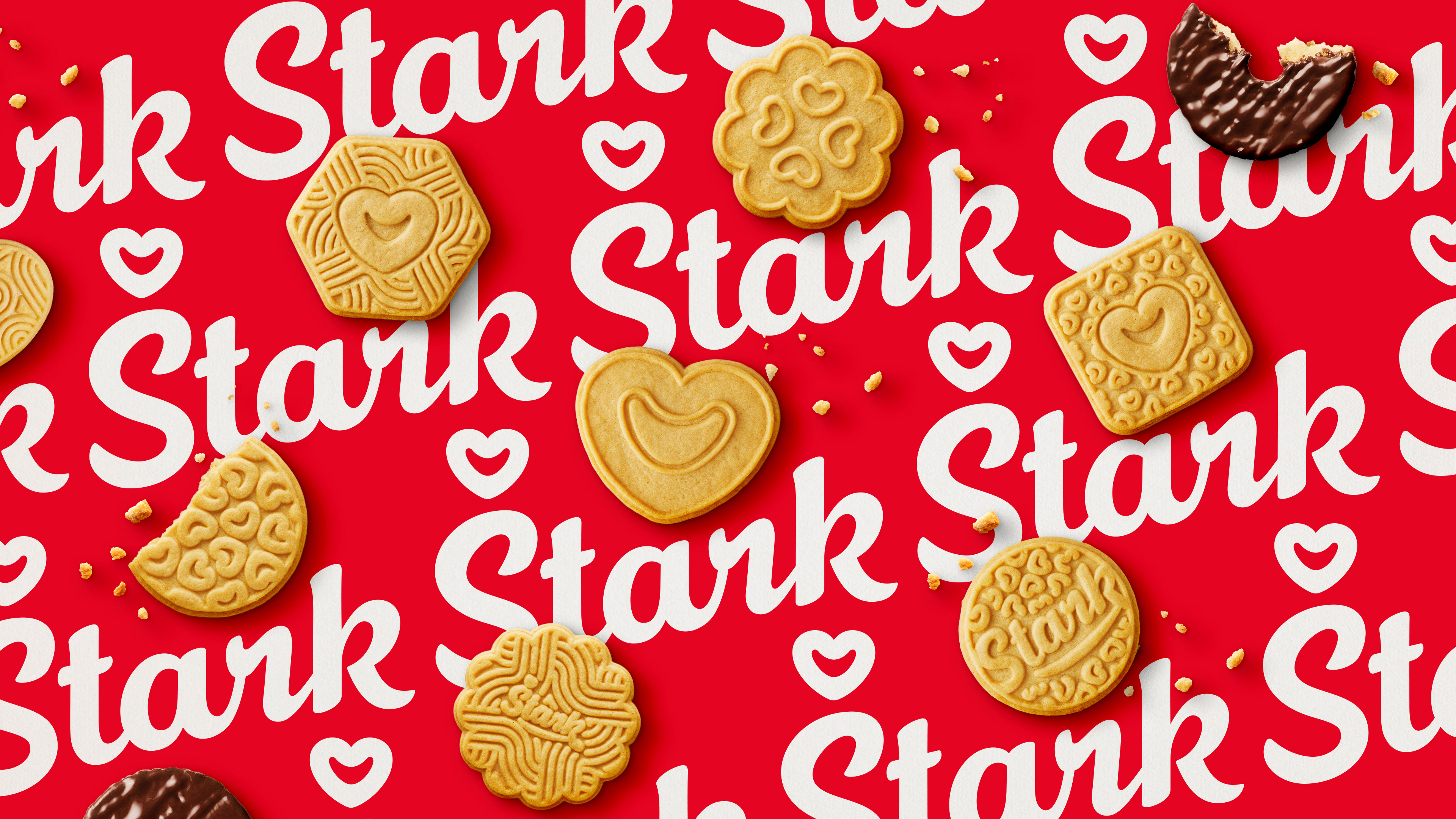
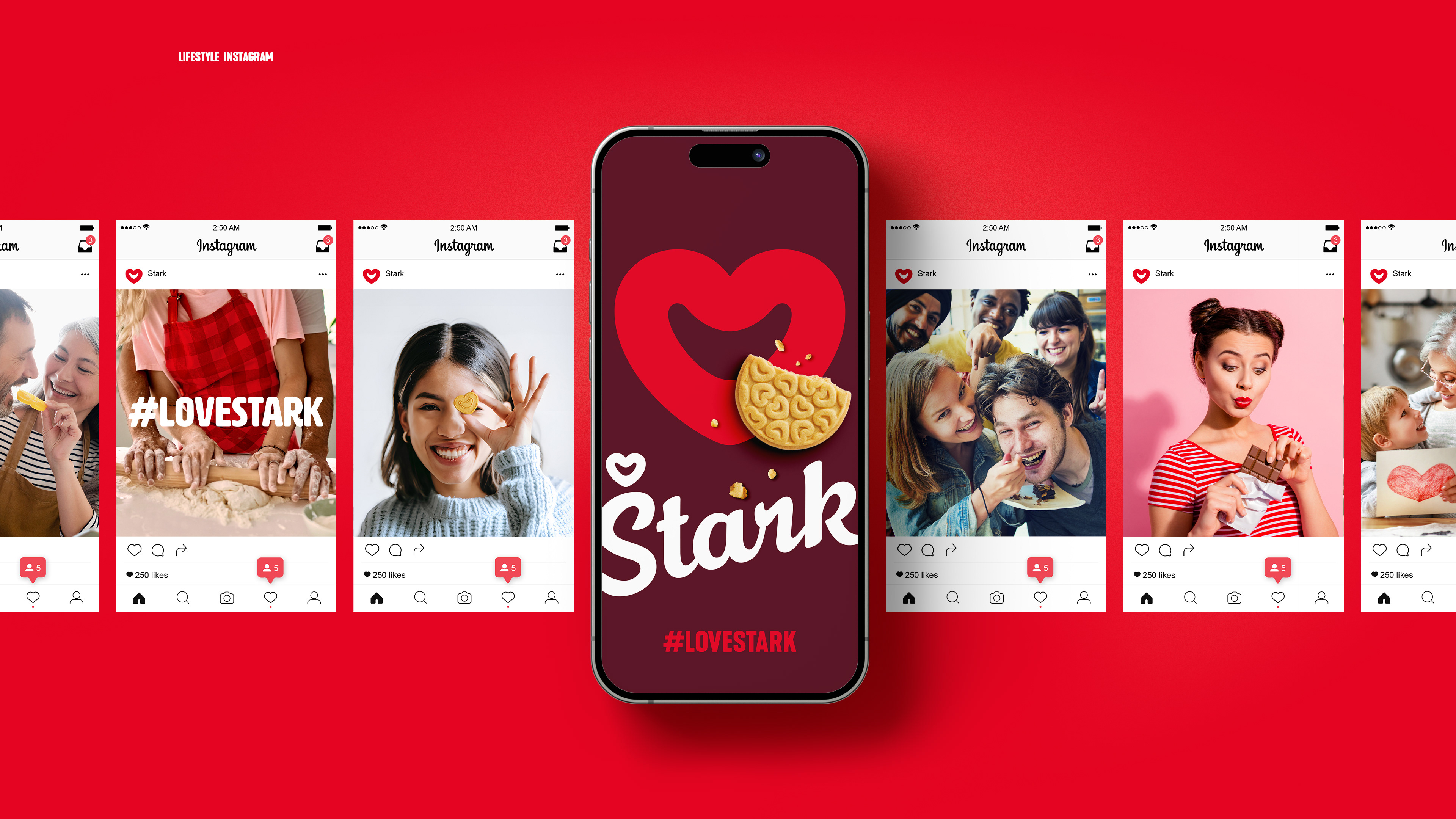
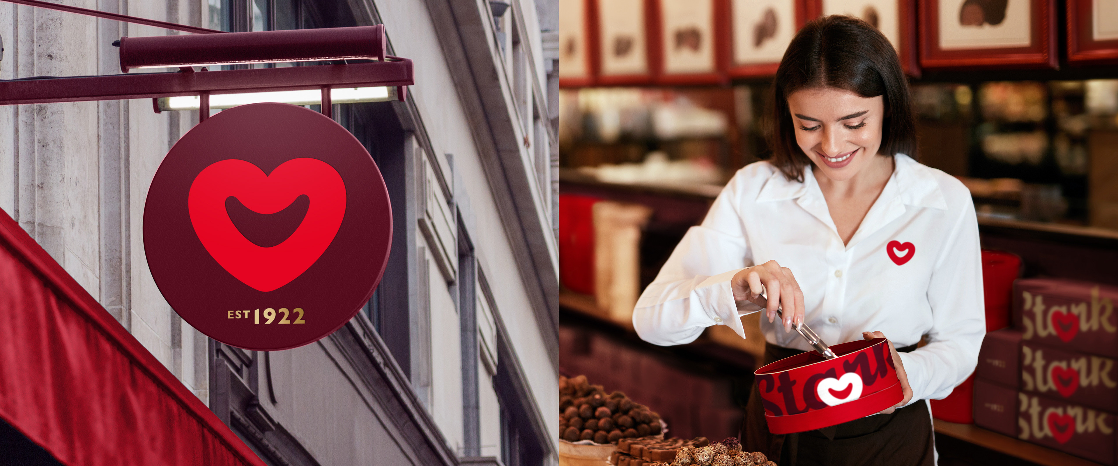
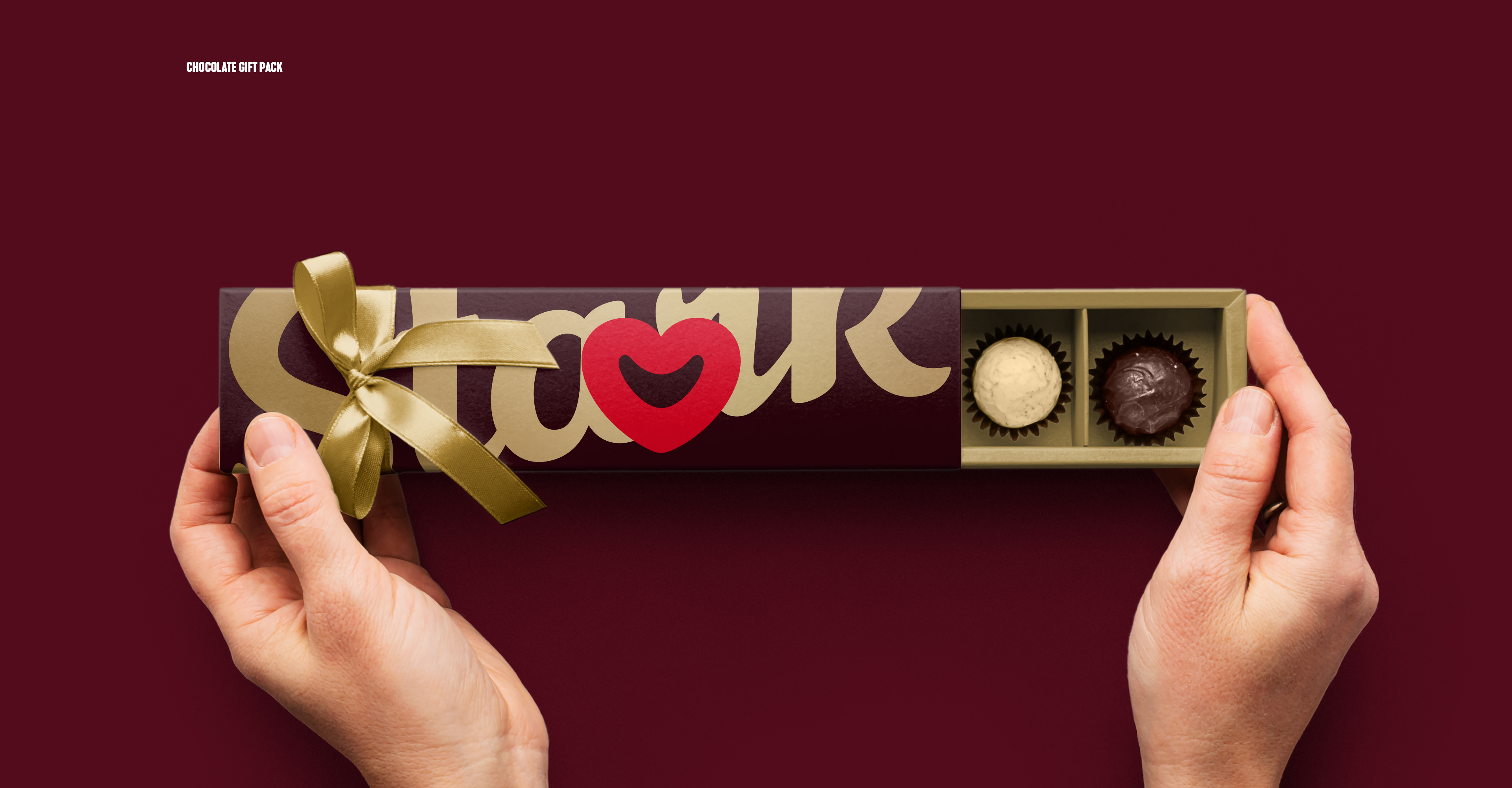
It was time to draw a smile & show love in every bite.
In the brand launch video below you can see how the final logo and packaging came to life.
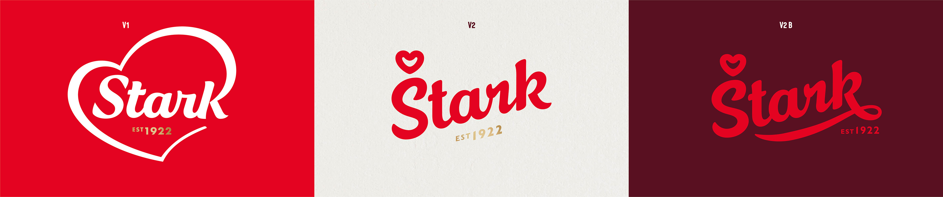
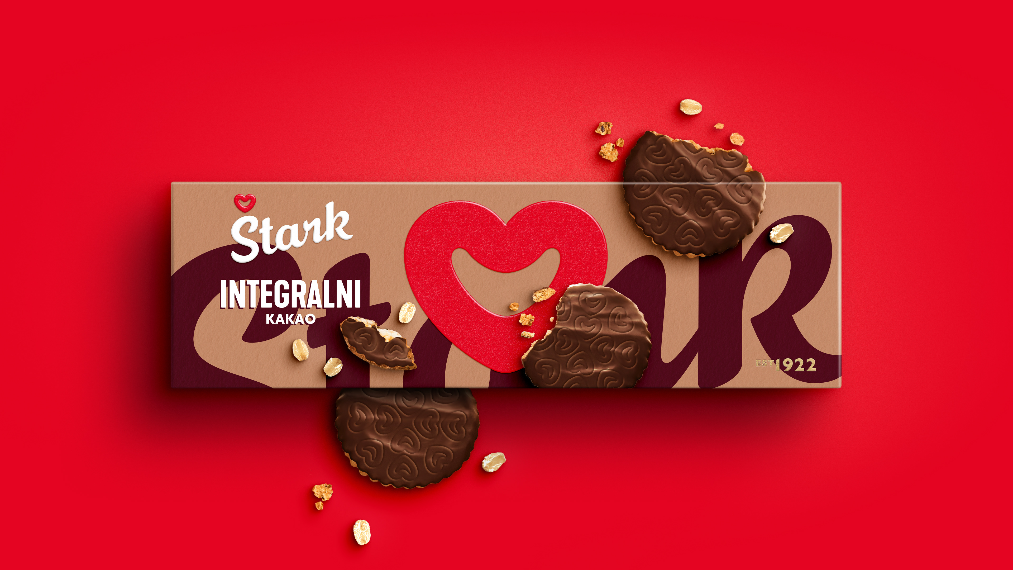
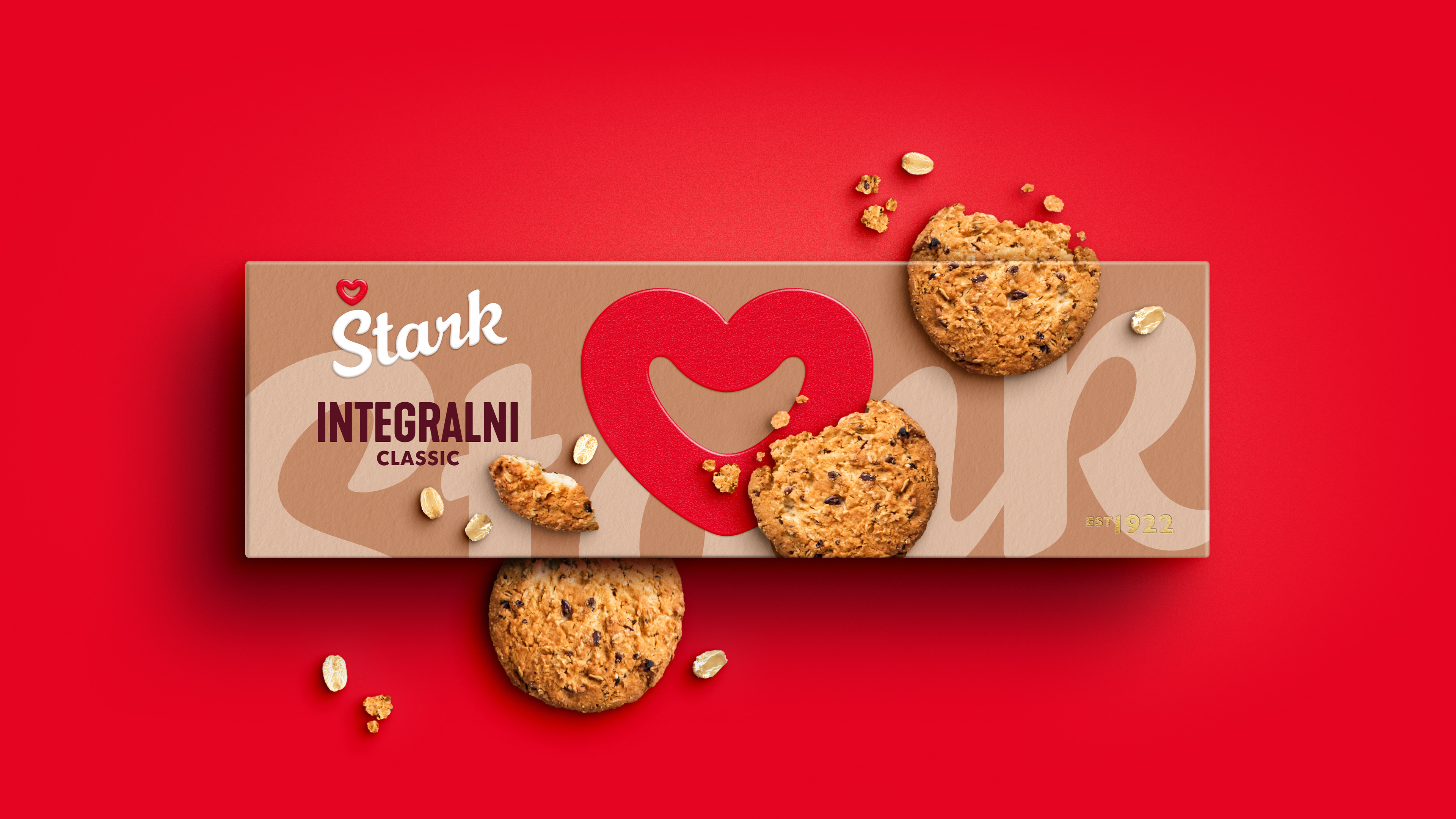
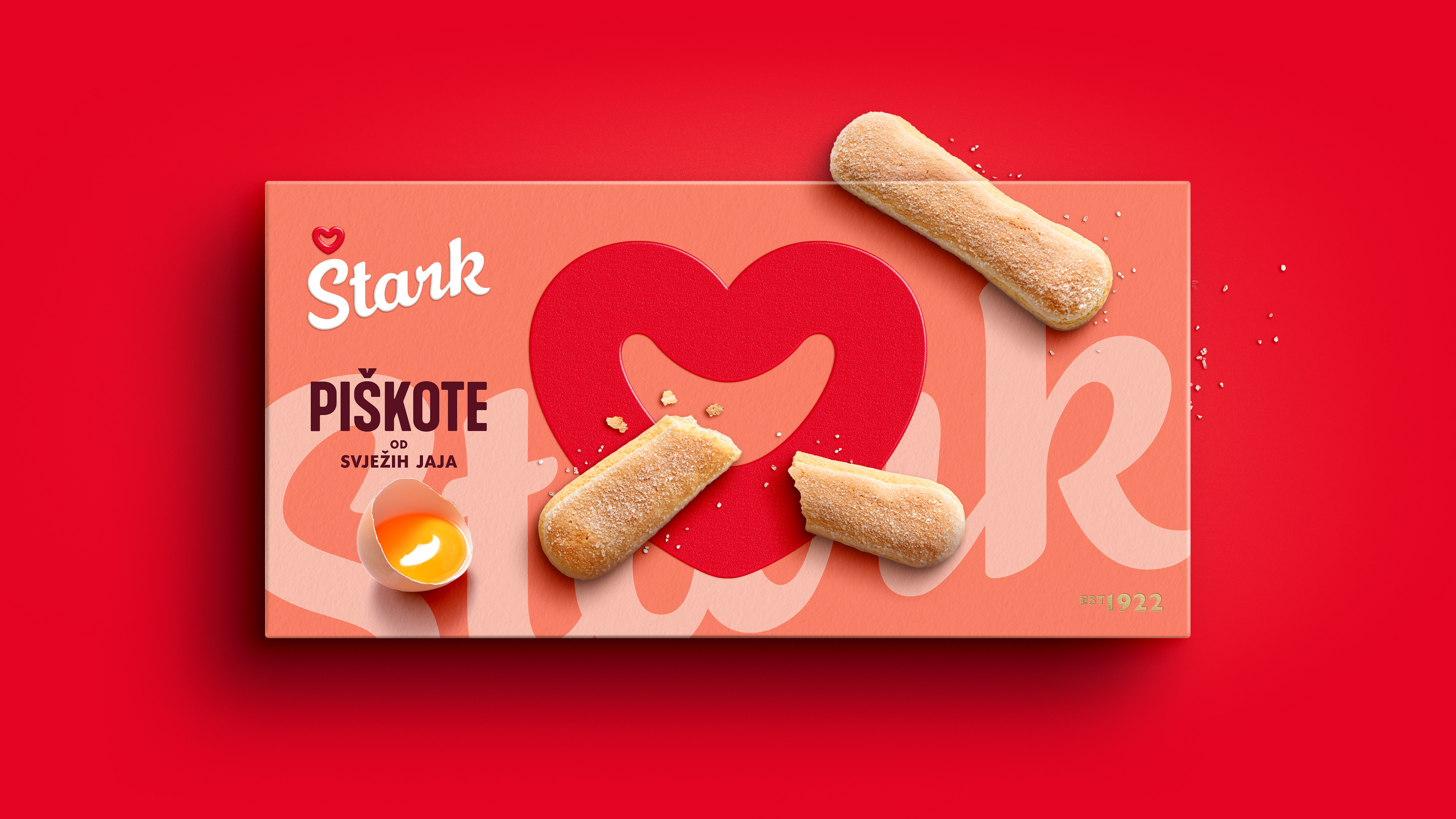
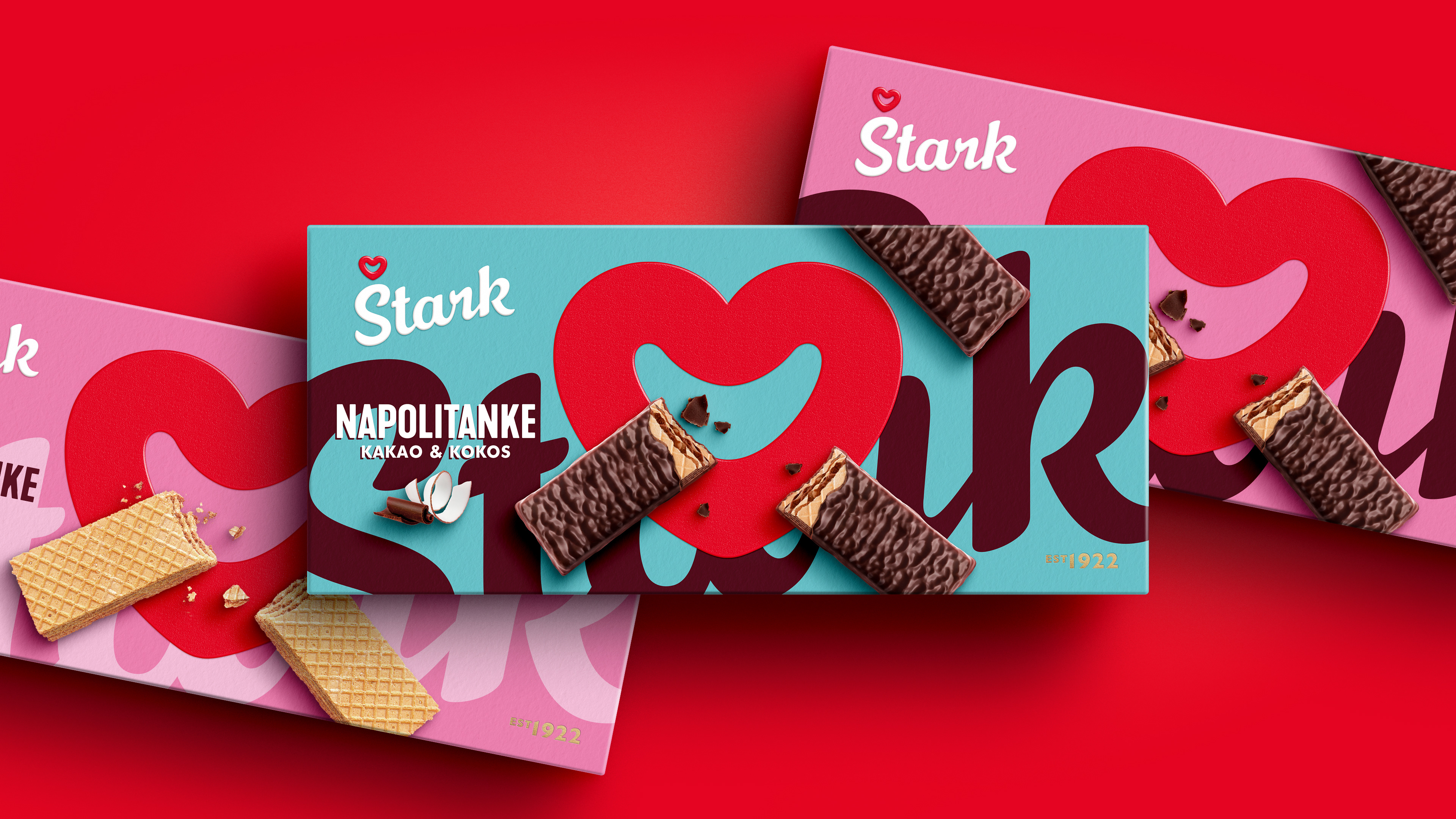
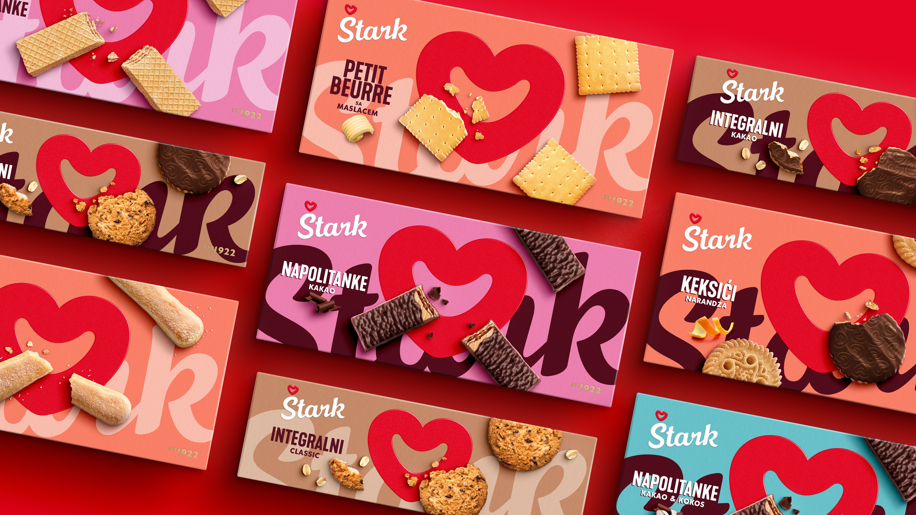
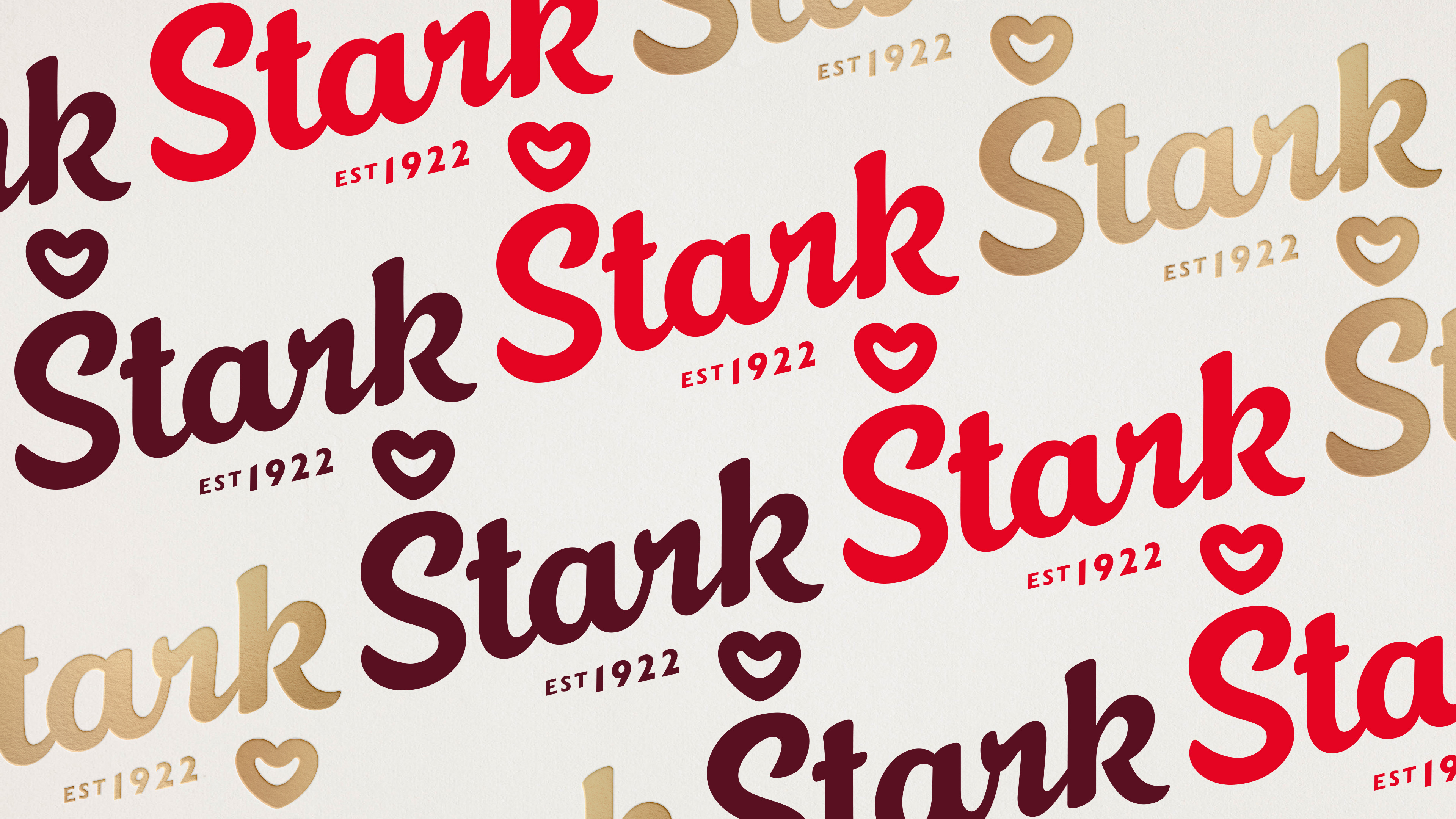
The client opted to refine a different execution of the logo, closer to the 60's logo,
and made it the center of the packaging that embraced the vibrant original colours.
and made it the center of the packaging that embraced the vibrant original colours.
But the happiness and quirkiness, together with the bold colour use is still very present
& the smile is there ;)
& the smile is there ;)